
The checklist
Use this before export, before localization and again before release. The goal is not decoration. The goal is instant comprehension.
Message clarity
- Each screenshot has one main idea.
- The first two screenshots explain the core value.
- Headlines describe outcomes, not menu names.
- Supporting copy is optional and short.
Visual hierarchy
| Element | Good sign | Risk sign |
|---|---|---|
| Headline | Readable in under two seconds | Long sentence split across many lines |
| Device | Shows proof of the claim | Covers the most important UI |
| Background | Supports contrast | Competes with text |
| Sequence | Builds a story | Feels like unrelated slides |
UI proof
Marketing copy needs visible proof. If a screenshot says "Plan faster", the app UI should show planning. If it says "Track progress", the user should see progress.
This is also a compliance issue. Apple's review guidelines require screenshots to show the app in use, although explanatory overlays are allowed. Google requires screenshots to demonstrate the actual in-app experience and accurately reflect the current version.
Consistency
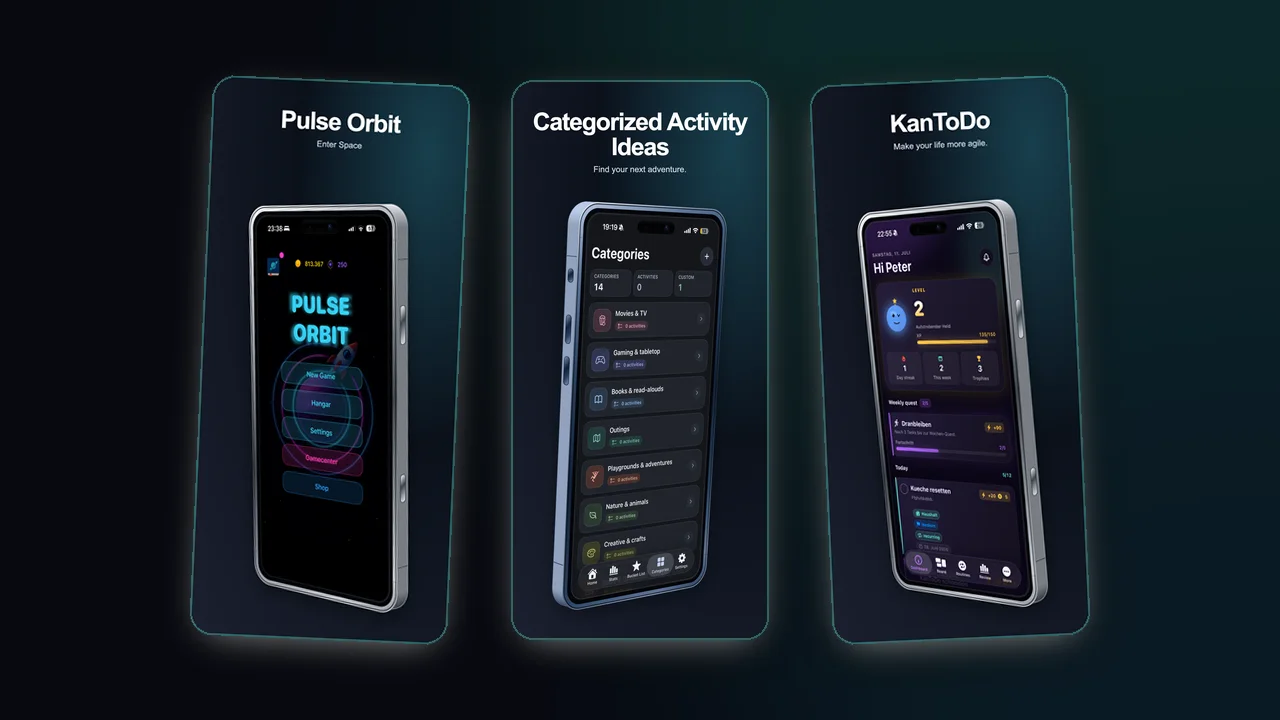
Consistency does not mean every frame is identical. It means a user can tell the screenshots belong to the same product.
Check these details
- Same font family and weight logic.
- Related spacing between headline, device and edge.
- Harmonized background colors.
- Similar device scale unless the story needs a close-up.
Store compliance pass
- Replace obsolete screens after major UI changes.
- Do not use another product's UI or trademarks without permission.
- Make paid or subscription-only content clear.
- Keep public listing assets suitable for the store audience.
- On Google Play, remove ranking, pricing and promotional badges.
- Verify the required dimensions and formats immediately before upload.
Accessibility pass
Do not rely on color alone to connect a headline to a UI element. Keep contrast strong, avoid tiny text and preserve a logical reading order. For Google Play graphics, provide concise alt text describing the meaningful screen state.